Turning raw data into accurate insights is a key part of any research. In Avicenna Research, the Analysis section allows researchers to explore data quality, coverage, and engagement across studies, participants, and data sources.
All analytical data and visualizations are available in the Analysis section of the researcher dashboard.
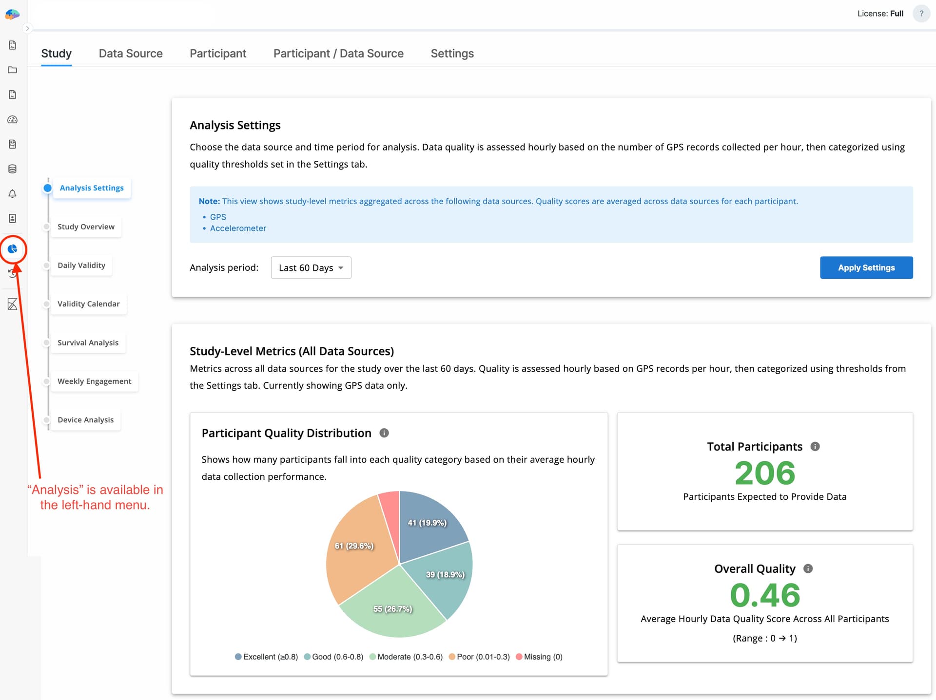
To support analysis at different levels of detail, Avicenna provides four analysis levels, each with its own charts and metrics:
- Study level
- Data source level (within a study)
- Participant level (across all data sources)
- Participant level within a single data source
You can customize how analytical data and charts are displayed across all levels in the Settings tab.
Settings Tab
The Settings tab provides the foundation for all analytical views. It defines how data quality is calculated and how results are visually categorized across the platform.
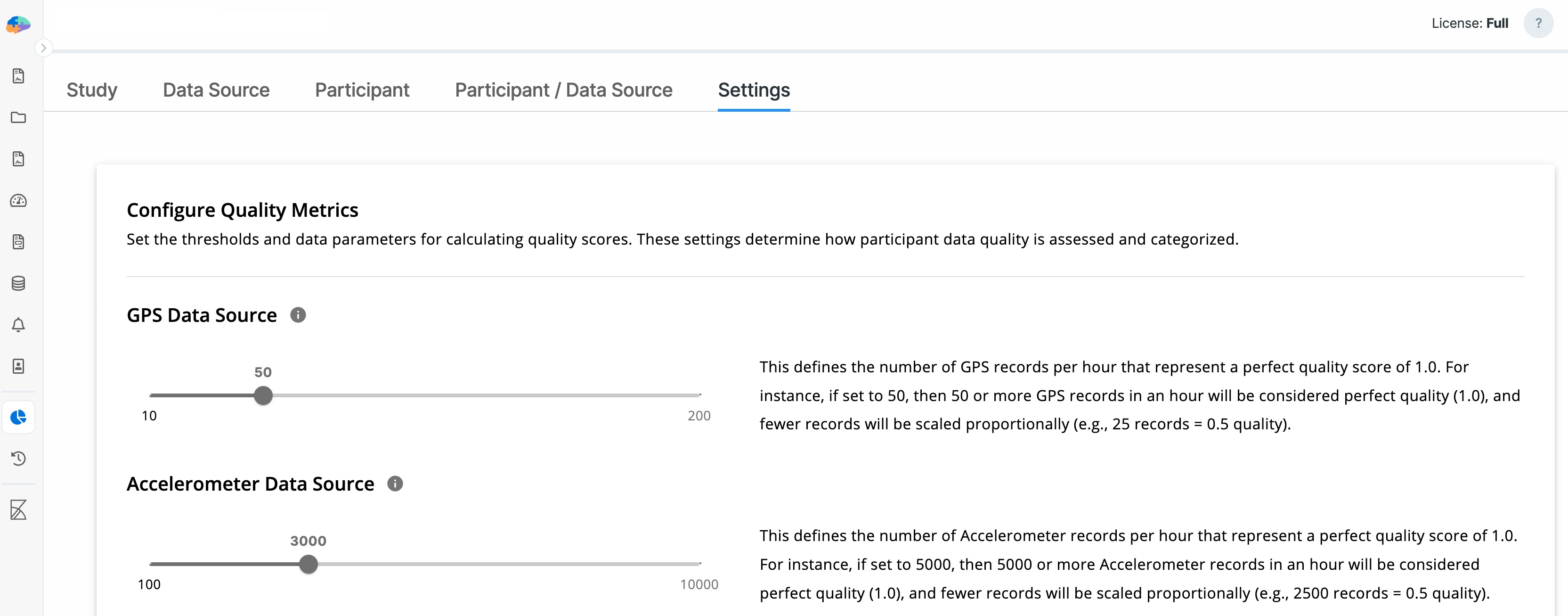
Data Source Settings
Researchers can specify the expected number of data points per hour for each registered data source.
For each hour:
- If the received data points meet or exceed the expected value, the data quality score is set to 1
- Otherwise, the score is calculated as a value between 0 and 1, proportional to the received data volume
This normalization ensures that data quality across different data sources can be compared and aggregated meaningfully.
For example, for GPS data, an expected range of 10–200 points per hour can be defined. Based on typical Android and iOS behavior, the default expected value is 50.
In this case:
- If more than 50 GPS points are received in one hour, the quality score is 1
- If only 25 GPS points are received, the quality score for that hour is 0.5
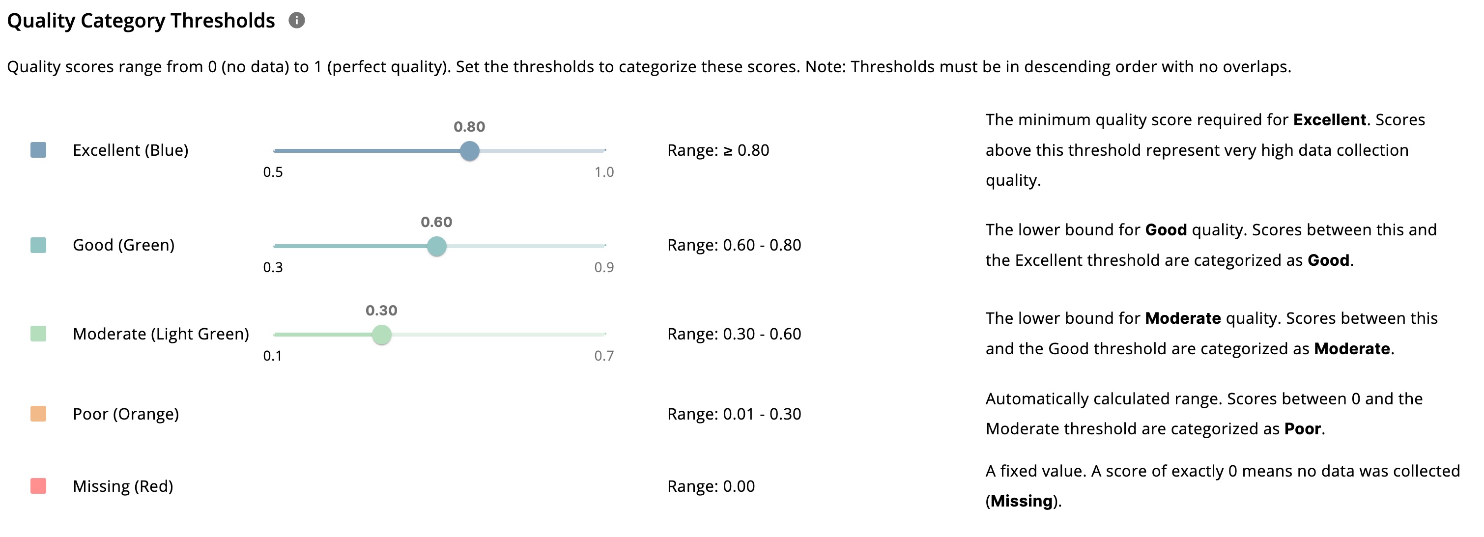
Visualization Settings
To make interpretation easier, data quality is grouped into five standardized categories:
- Missing
- Poor
- Moderate
- Good
- Excellent
Researchers can define numeric ranges for each category, and all charts are visualized based on these definitions. If ranges overlap, the system automatically adjusts them.
Study Tab
The Study tab provides a high-level overview of data quality and coverage across all participants and all data sources.
In the following sections, we’ll explain each component of this page in detail.
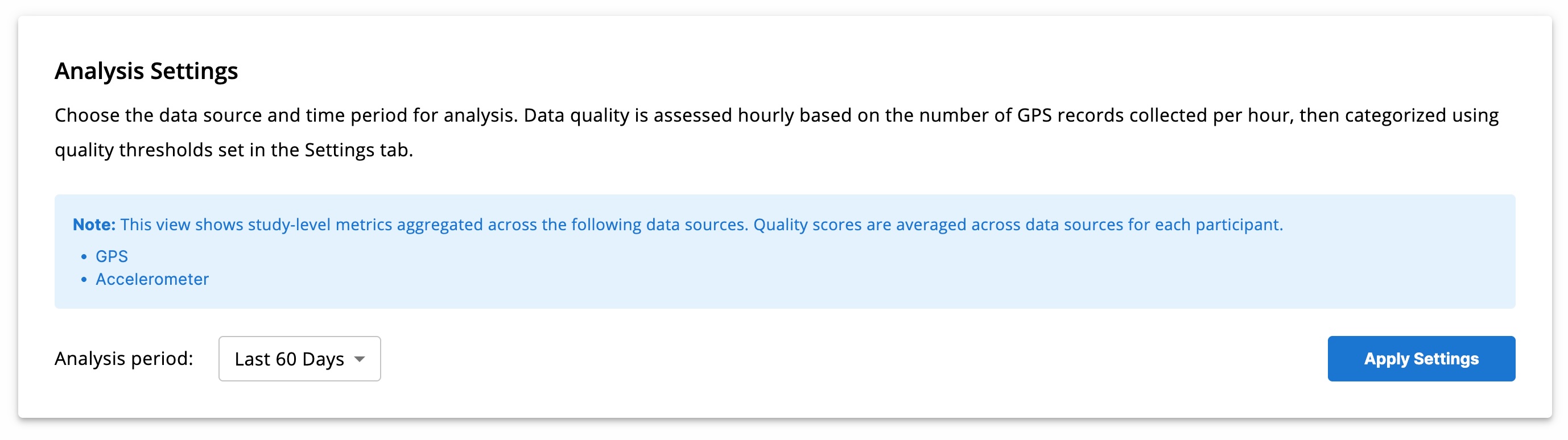
Analysis Settings
Researchers can restrict analysis to a specific time range. Only data and quality metrics within this range are displayed.
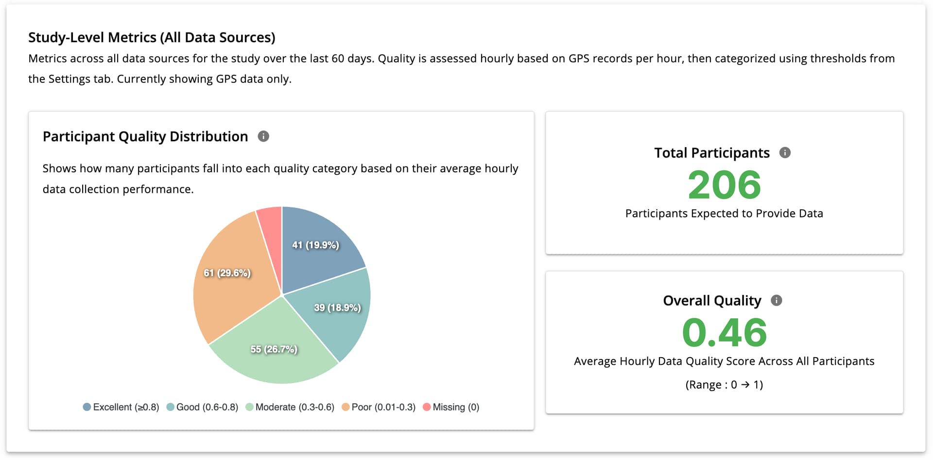
Study-Level Metrics (All Data Sources)
This section shows:
- Total number of participants in the selected period
- Overall data quality score (0–1), averaged across participants, hours, and data sources
A pie chart visualizes the distribution of participant data quality (excellent, missing, poor, etc.) for the selected time range.
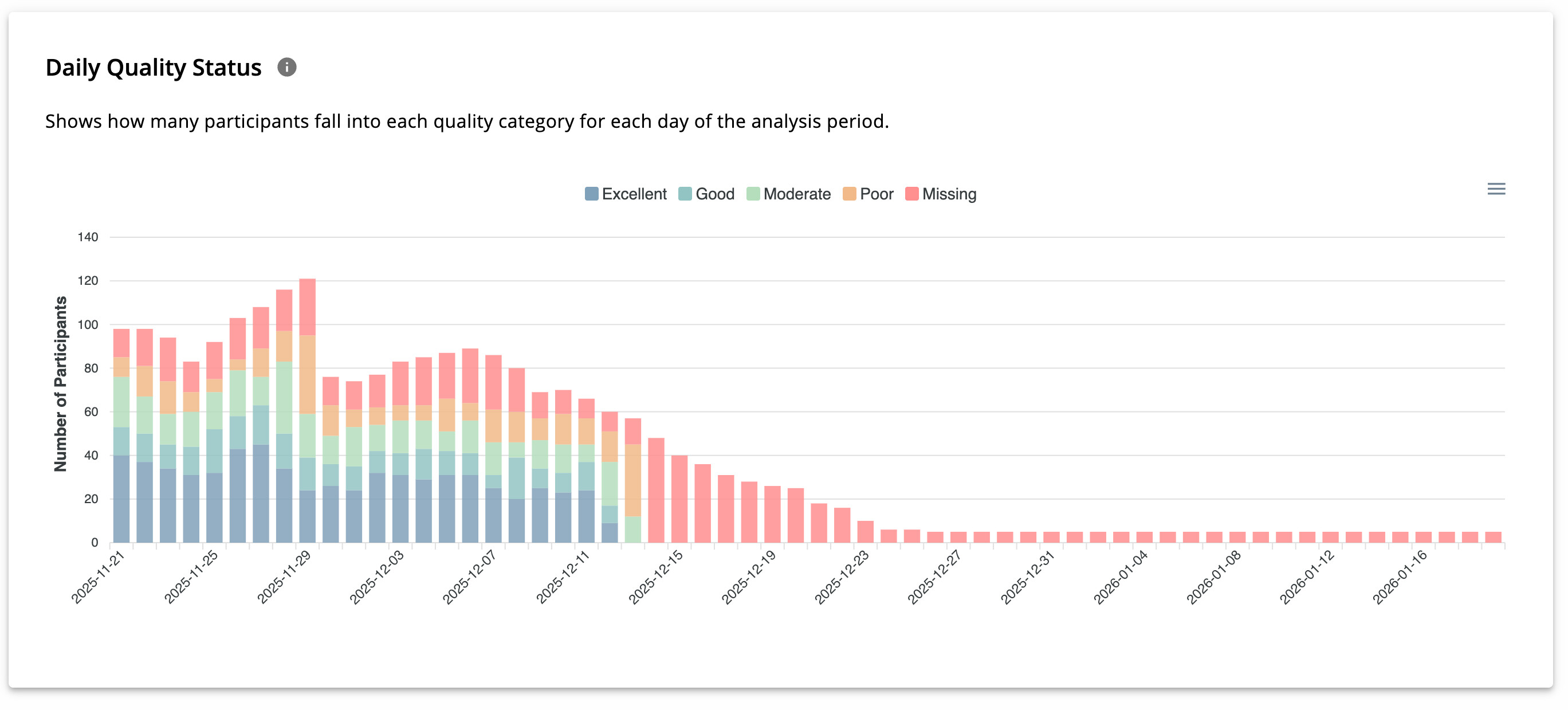
Daily Quality Status
The Daily Quality Status chart displays day-by-day changes in participant data quality. Hovering over each bar reveals the number of participants in each quality category for that day.
This view is useful for identifying daily fluctuations in data collection performance.
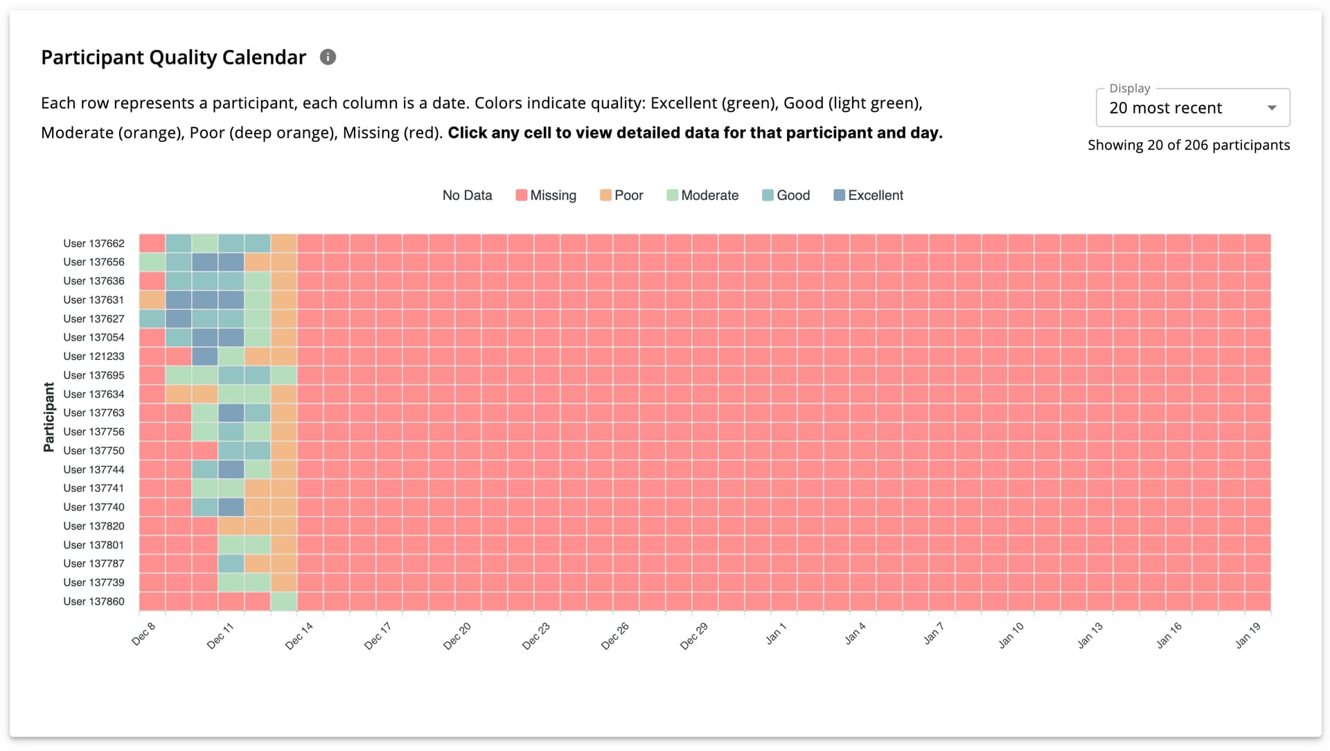
Participant Quality Calendar
This calendar-style chart displays participant-level data quality per day by:
- Each cell represents one participant on one day*
- Hovering reveals detailed metrics
- Clicking navigates to participant-level analysis
The number of displayed participants can be adjusted using a dropdown in the top-right section.
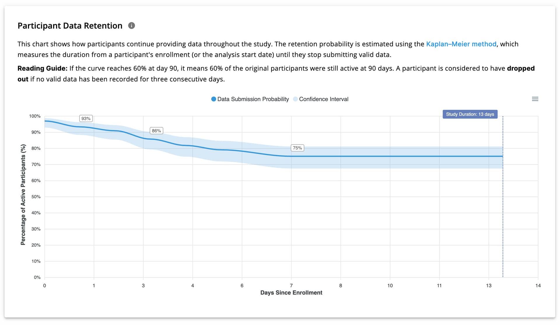
Participant Data Retention
Participant retention is calculated using the Kaplan–Meier method and visualized as shown in the image below.
- X-axis: Days since enrollment
- Y-axis: Probability of continued data provision
For example, a retention probability of 60% on day 12 means that 60% of participants are expected to still be providing data on day 12.
This view enables researchers to deploy push notifications, email reminders, or engagement strategies to improve data continuity and engagement.
[!note]
Kaplan–Meier is used because it handles variable follow-up durations and censored data, which are common in longitudinal studies. It is widely used for retention and survival analysis in research settings.See here for more details.
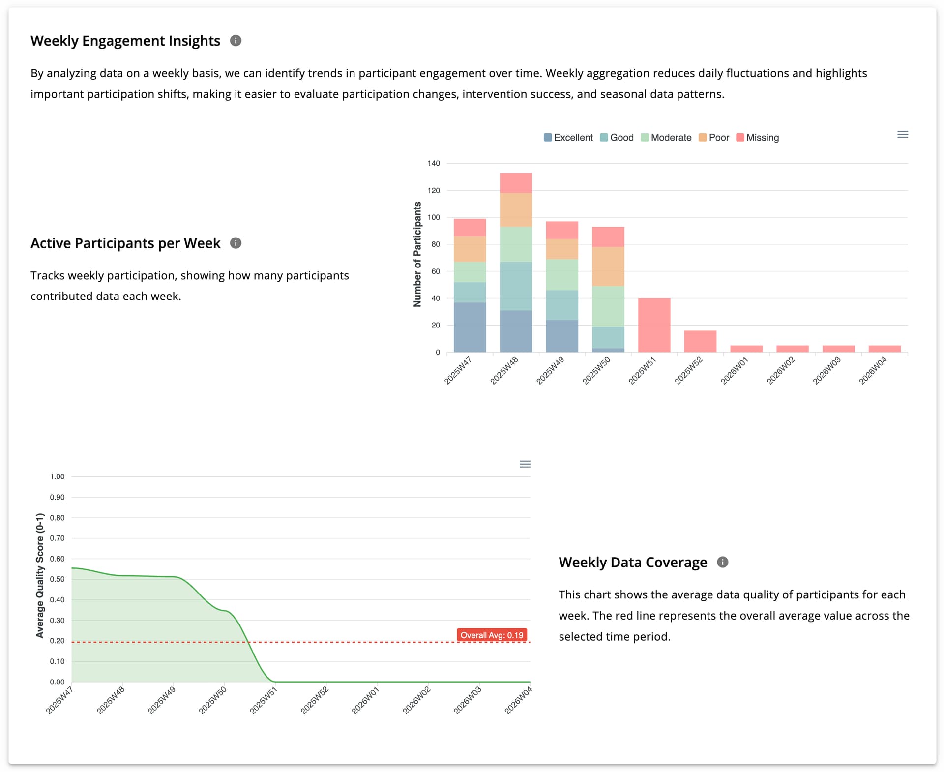
Weekly Engagement Insights
Weekly analysis reveals long-term trends in participation and data quality. This section includes two charts:
- Weekly participant counts categorized by data quality
- Average weekly data quality
Together, these charts help researchers evaluate engagement and quality trends over time.
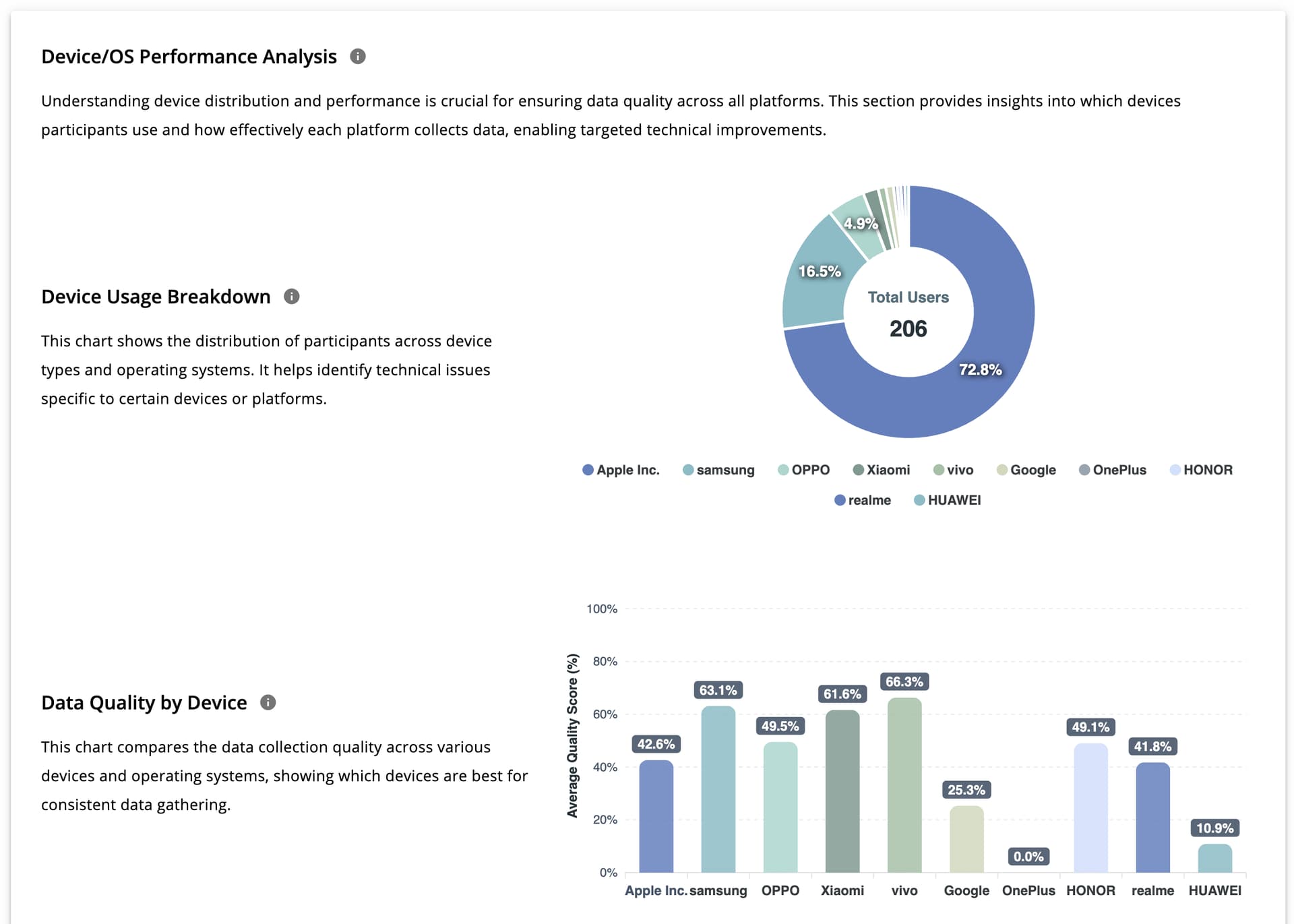
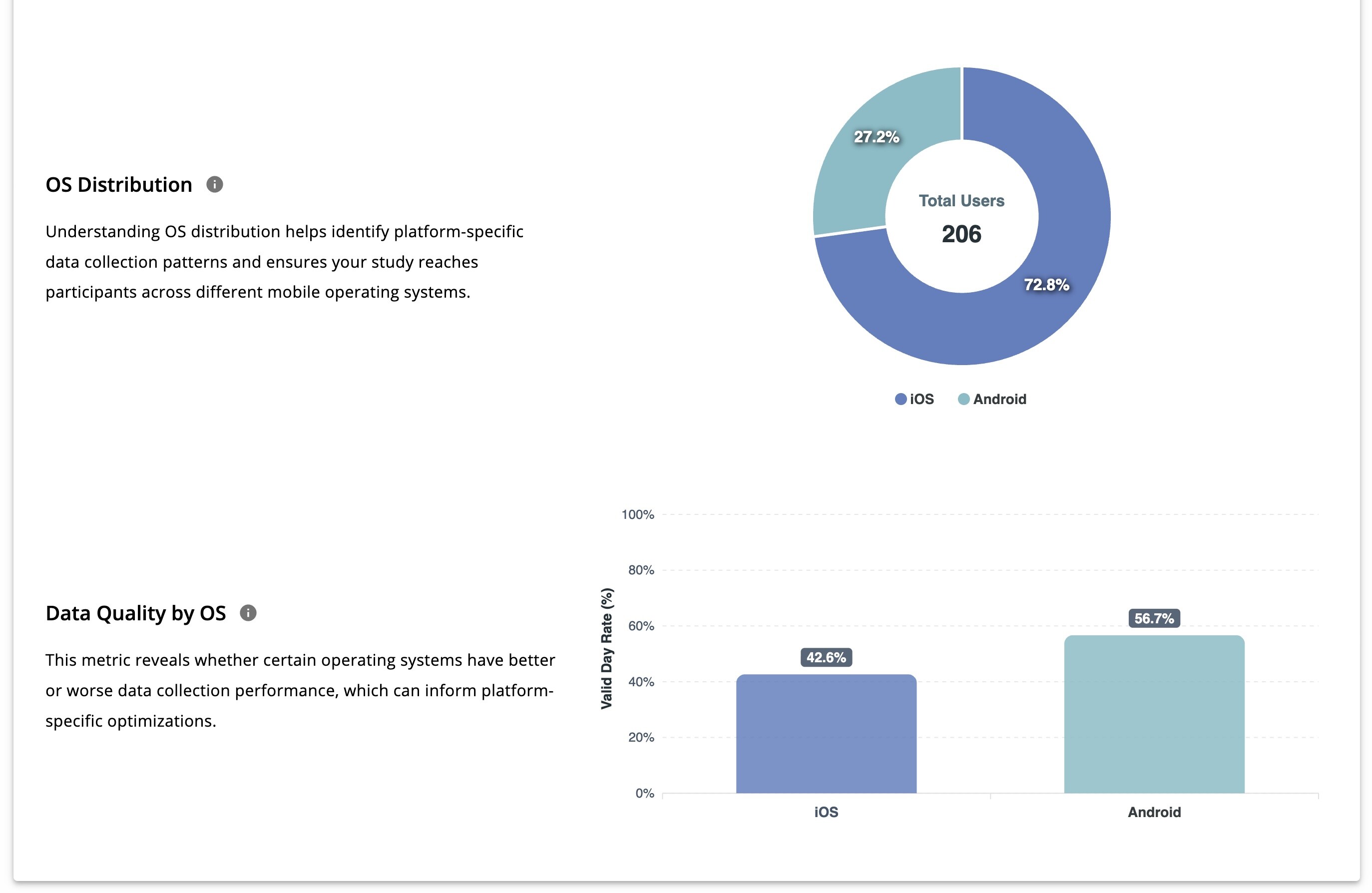
Device / OS Performance Analysis
This section evaluates data quality across devices and operating systems. It includes:
- Device usage distribution
- Data quality by device model
- OS distribution (donut chart)
- Data quality by OS
These views help researchers identify device- or OS-specific data issues.
Data Source Tab
The Data Source tab focuses the analysis on a single registered data source within a study (for example, GPS).
After reviewing data at the study level, researchers can examine the analytics at the data-source level. In the Analysis Settings section of this tab, they can switch between different data sources. Once a data source is selected, all charts and metrics automatically update to reflect the chosen source.
[!note]
All charts available in the Study tab are also available here, but now they are calculated based on each data source instead of the whole study. The only exception is Participant Data Retention, which applies to the entire study and does not change when a data source is selected.
This tab includes:
- Data Source Metrics
- Daily Quality Status
- Participant Quality Calendar
- Weekly Engagement Insights
- Device and OS Performance Analysis
Participant Tab
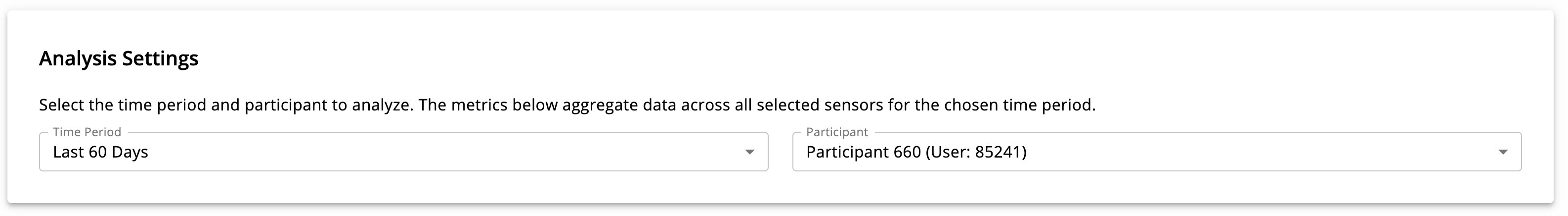
After analyzing data at the study and data-source levels, researchers can further examine data at the individual participant level, across all data sources.
Using the Analysis Settings section, researchers can:
- Define a time range
- Select a participant from the dropdown list
Once selected, all charts and metrics update to show the chosen participant’s data within the defined time range.
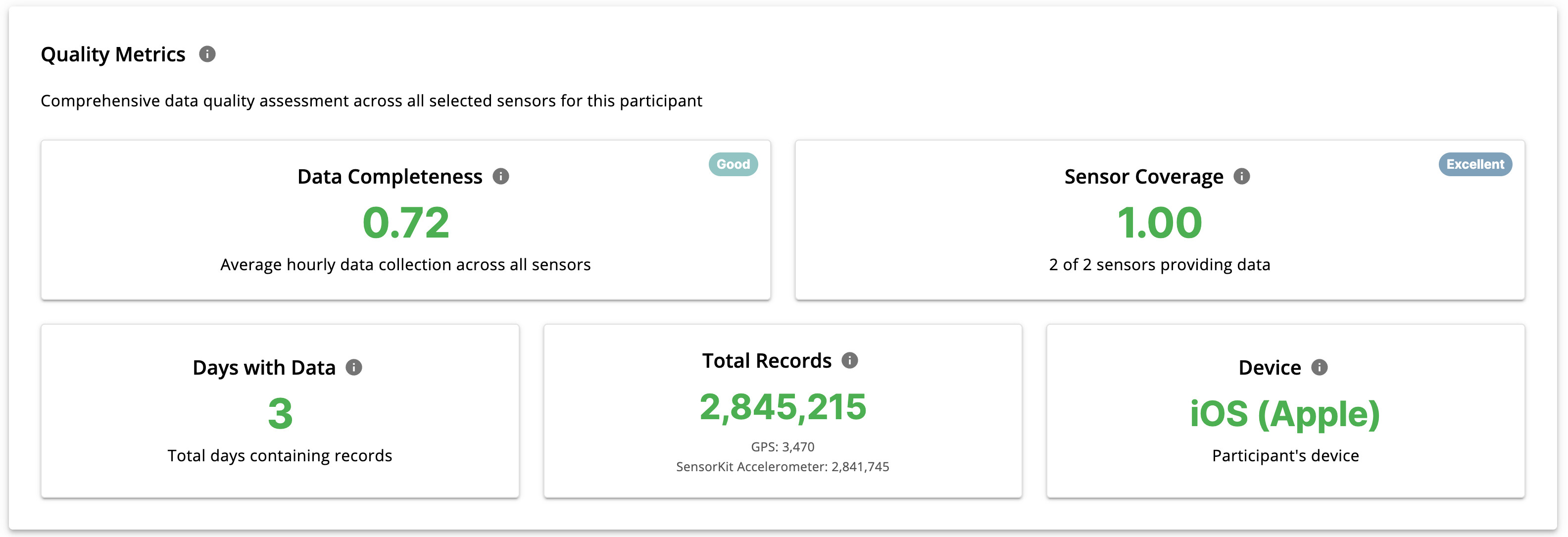
Quality Metrics
This section displays participant-level metrics, including:
- Data Completeness: average hourly data quality across all data sources
- Sensor Coverage: which registered data sources provide data for the selected participant
- Days with Data
- Device information
- Total records per data source
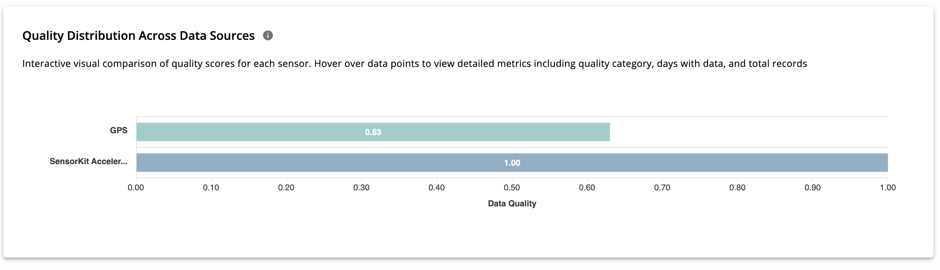
Quality Distribution Across Data Sources
A horizontal bar chart compares data quality across the participant’s data sources using a normalized scale from 0 to 1. This makes it easy to identify which sensors contribute most (or least) to overall data quality.
Participant / Data Source Tab
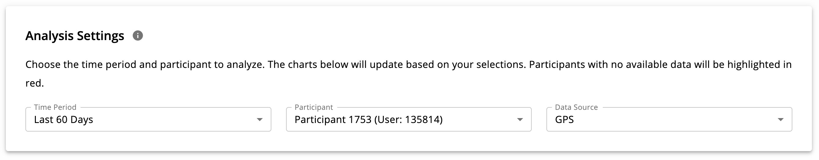
This tab provides the most detailed level of analysis, focusing on one participant within one data source.
In the Analysis Settings section, researchers can select:
- Time range
- Participant
- Data source
In addition to raw data analysis, this section also displays derived features generated from the selected data source.
Below, GPS-specific analyses are used as an example.
GPS Data Analysis
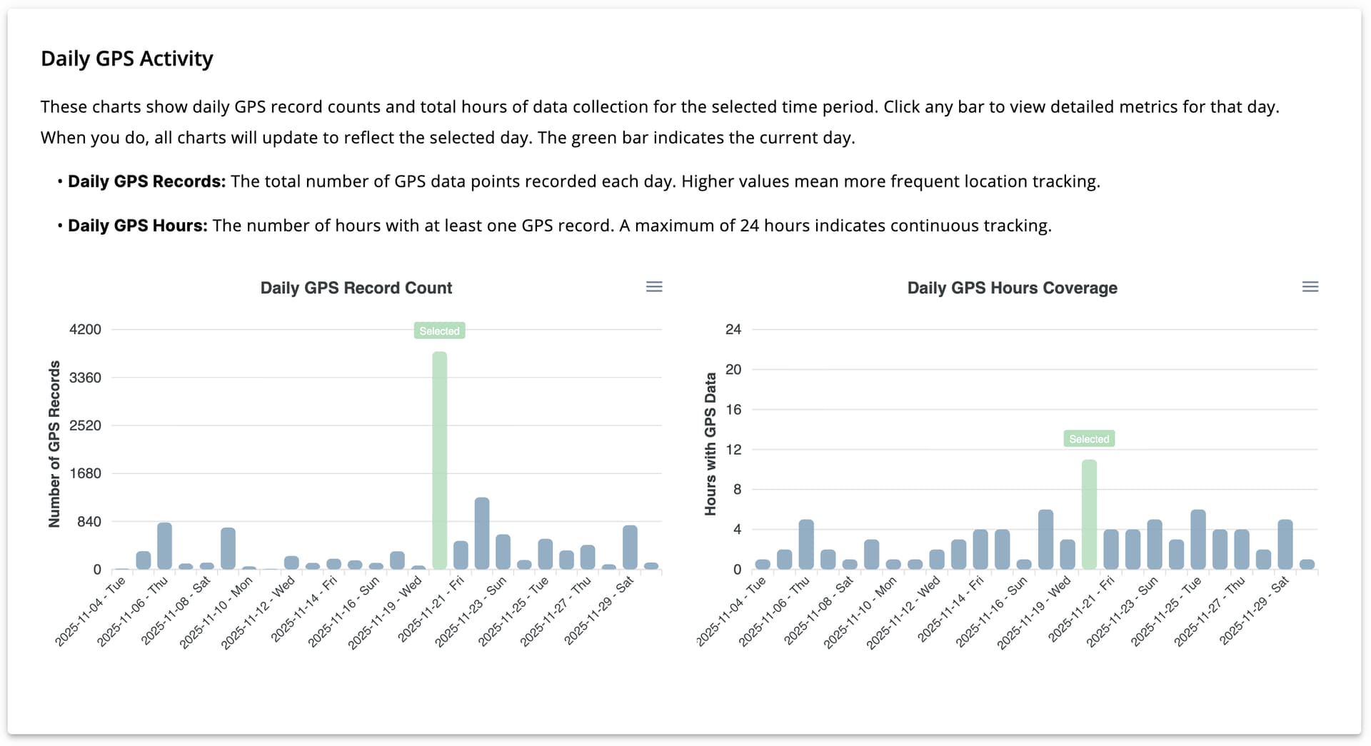
Daily GPS Activity
This section includes two bar charts:
- Daily GPS Record Count
- Daily GPS Hours Coverage
These charts show how many GPS data points were collected per day and how many hours (out of 24) contain GPS data. Clicking on a bar updates all charts to reflect the selected day.
Mobility Patterns
Mobility features derived from GPS data are displayed as four scatter plots.
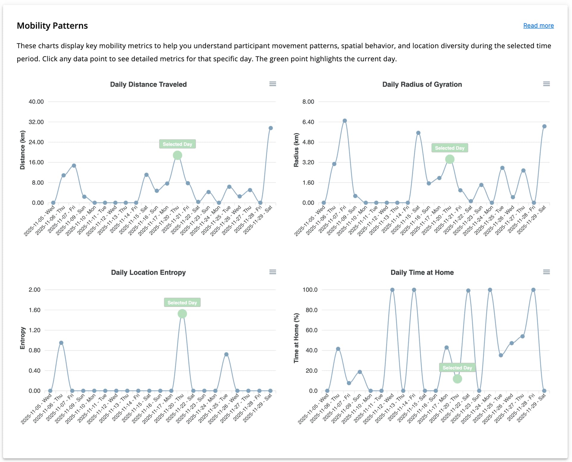
Because these features are newly generated, their detailed computation is explained separately here. All charts are interactive; clicking on a data point updates all visualizations to reflect the selected day.
The mobility features include:
- Daily Distance Traveled: total distance traveled by the participant in a day
- Daily Radius of Gyration: the estimated radius of movement around the participant’s geographic center
- Daily Location Entropy: spatial diversity of visited locations, calculated using the formula explained in this link
- Daily Time at Home: estimated percentage of time spent at home during a 24-hour period.
- A location is classified as home if the participant is present there between 00:00 and 05:00.
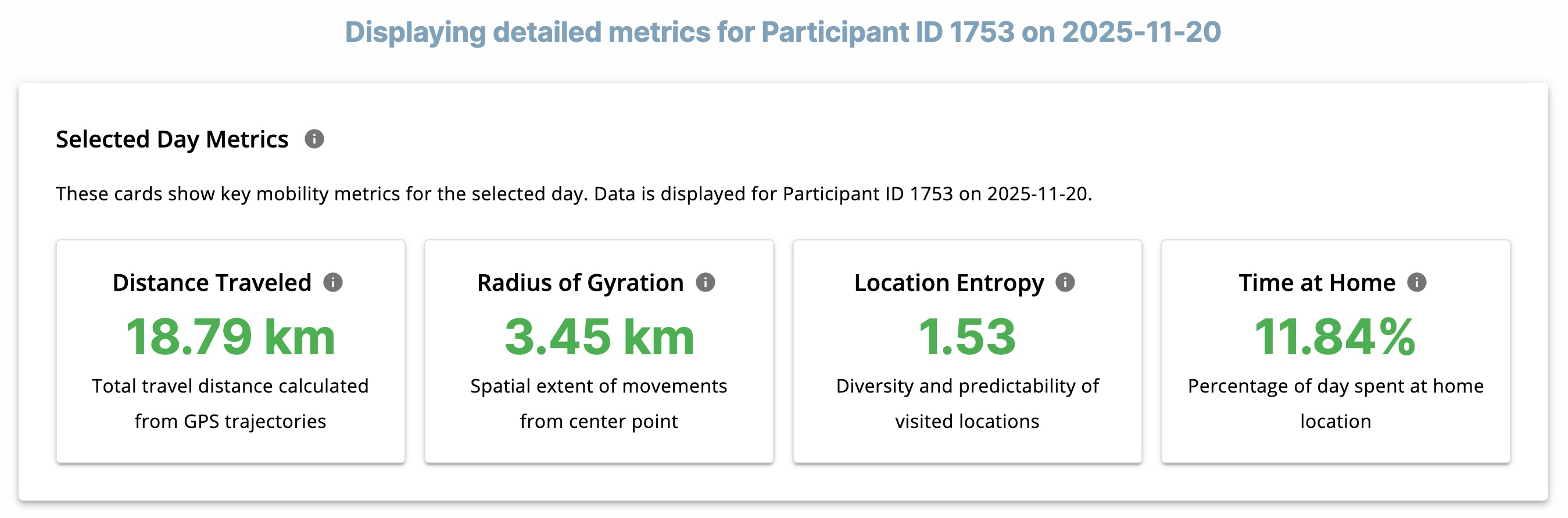
Selected Day Metrics
Four descriptive cards display the generated mobility features for a selected day:
- Distance Traveled
- Radius of Gyration
- Location Entropy
- Time at Home
These values represent the mobility features for participant X on day Z.
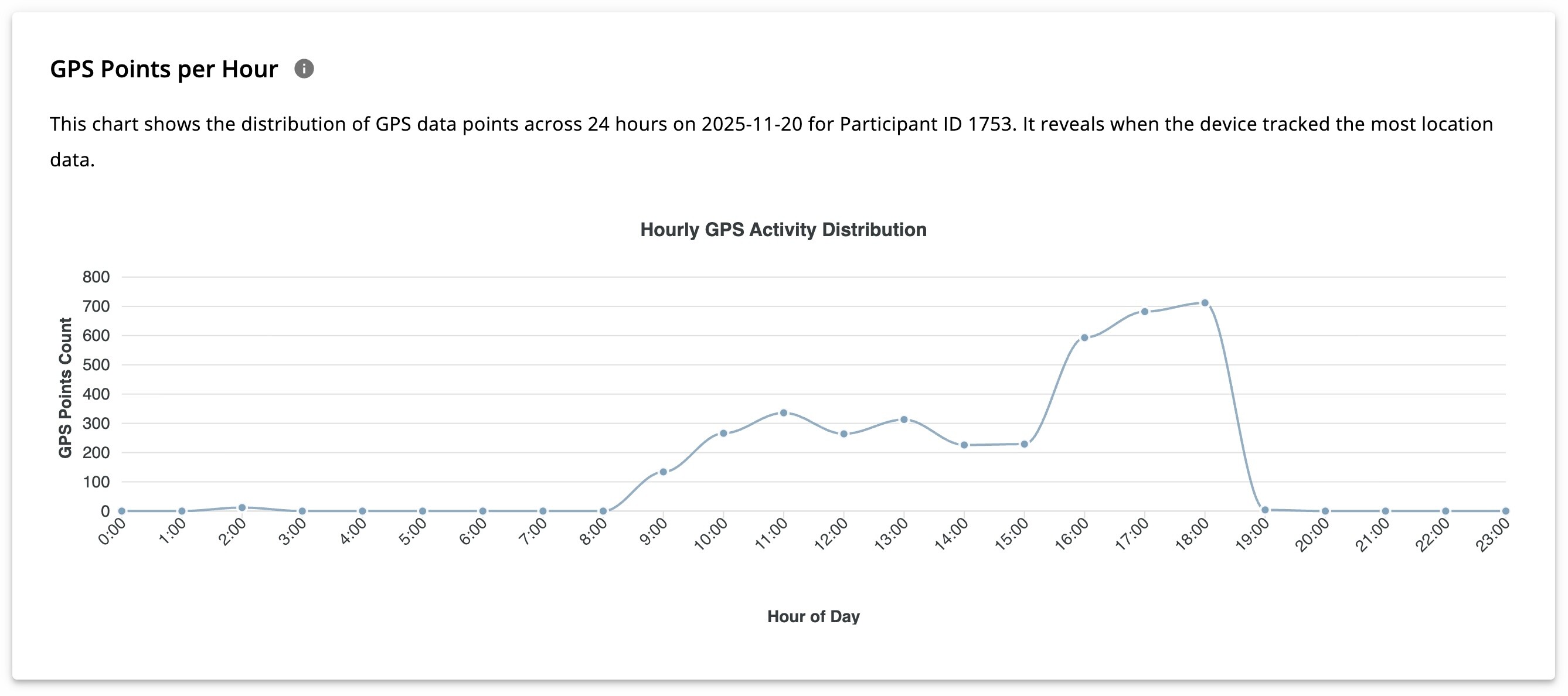
GPS Points Per Hour
The GPS Points Per Hour scatter plot shows the number of GPS points collected in each hour of the day.
- X-axis: 24 hours of the day
- Y-axis: Number of GPS points collected per hour
This chart illustrates the intra-day pattern of GPS data collection for a specific participant on a selected day.
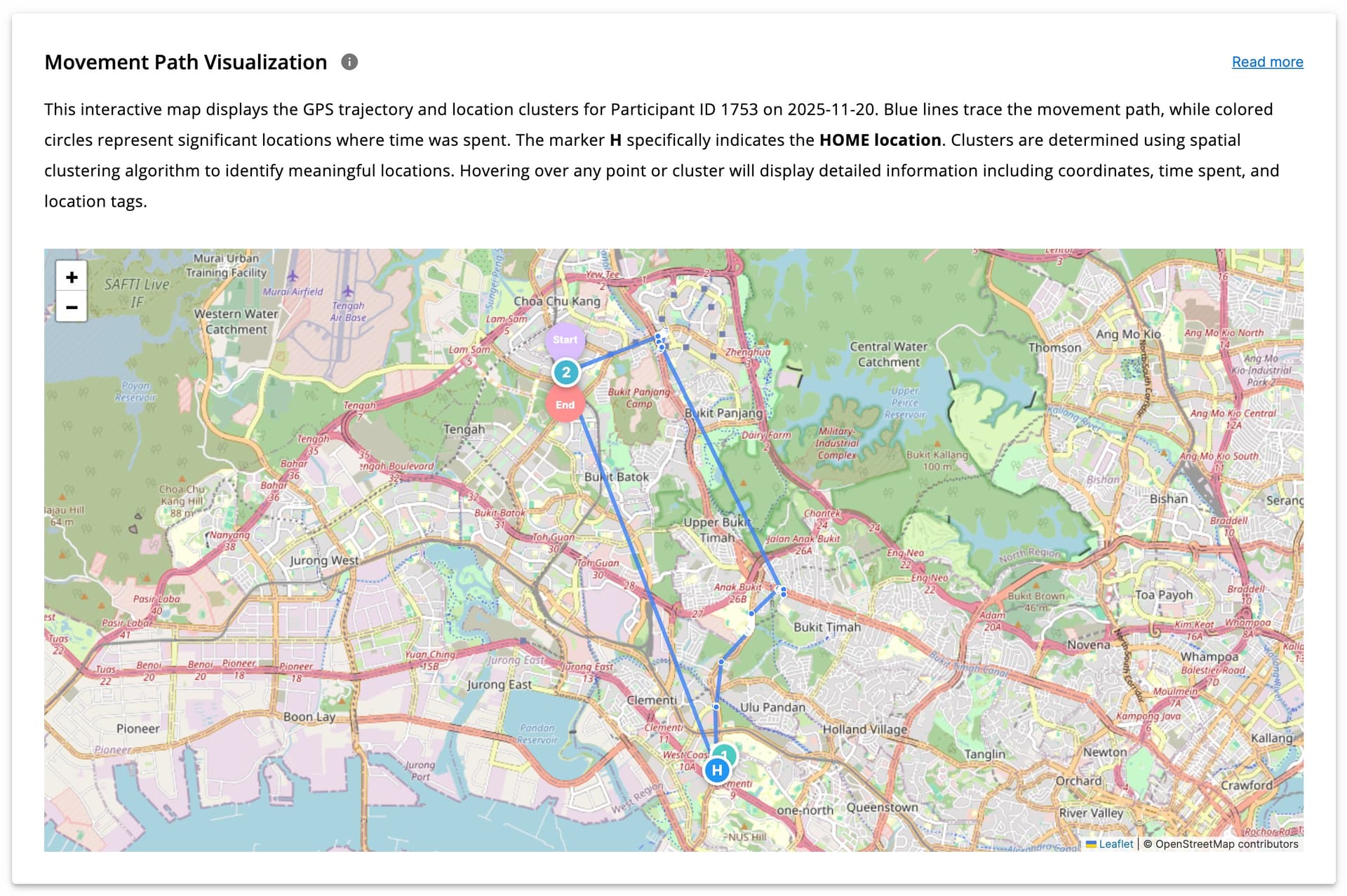
Movement Path Visualization
GPS clustering and its implementation using machine learning algorithms are explained in detail here.
Using clustering, GPS points are grouped into meaningful locations (e.g., home, workplace, university, or other frequently visited areas). This visualization shows the participant’s movement path throughout the day across different time periods, with clusters displayed clearly on the map.
Hovering over points reveals visit duration and time spent at each location (for clustered points). Start and end points of the day are also marked to make movement tracking easier.