What We Compute Each Day
When a phone records GPS, it generates long lists of latitude-longitude coordinates with timestamps. For researchers, this raw data is not an intuitive way to understand someone’s day.
Instead of thousands of raw points, we’d rather have a small set of simple numbers that answer clear questions:
- How far did this person travel today?
- How wide was their movement?
- How many different places did they visit?
- How much of the day did they spend at home?
In this post, we describe how we turn raw GPS streams into a compact set of daily mobility features. We focus on four main outputs:
- Total distance travelled during the day
- Radius of gyration
- Location entropy
- Time spent at home
We also compute daily location clusters, which represent the key places a person visited and the amount of time they spent at each location.
All of this runs in a nightly batch process. For each day, and for each active participant, we fetch their GPS data for that calendar day from our Apache Cassandra cluster. The data is processed in Python using:
- pandas for handling time series and grouping by user and day
- NumPy for numerical computations
- haversine package for distance calculations
- SciPy for smoothing and geometry operations
- scikit-learn for clustering with DBSCAN
A workflow tool such as Dagster then coordinates the steps, automatically processing the previous day’s data for all participants.
Daily Distance Travelled: How Far You Move
The simplest daily metric is the total distance travelled. Intuitively, this is the sum of the distances between consecutive GPS points across the day, after we apply some quality checks on the GPS data.
Mathematically, if the cleaned GPS positions for a day are:
then, the daily distance is:
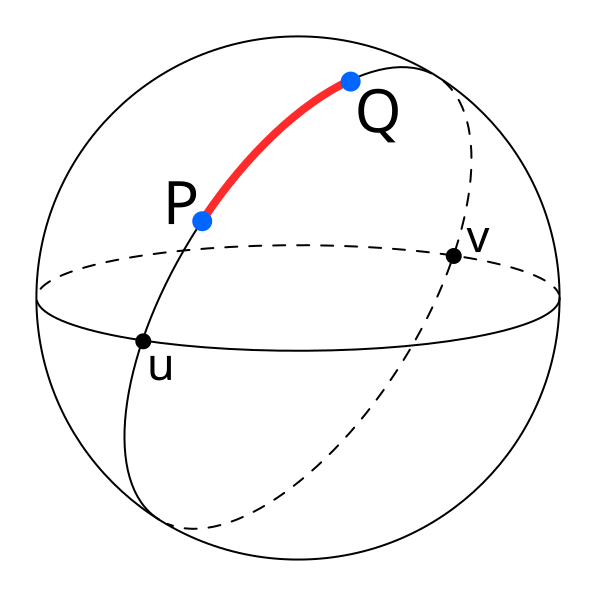
The Haversine function computes the great-circle distance between two geographic points, specified by their latitude and longitude, on the Earth’s surface. It assumes a spherical Earth and uses a mean radius of approximately 6,371 km. The Python haversine package implements this formula and lets us compute these distances in kilometers in a simple and reliable way.
| A diagram illustrating great-circle distance between two points on a sphere, P and Q. Source |
The computation follows a few clear steps:
1. Data selection and resampling
For each user and each day, we fetch all GPS points recorded between 00:00 and 23:59. We then resample these points to regular one-minute intervals using tools from pandas. Resampling avoids very dense bursts of data in some periods and gaps in others, and gives us a smoother and more uniform signal.
2. Trajectory smoothing
Next, we smooth the latitude and longitude series using a Savitzky–Golay filter from “scipy.signal”. This filter fits small polynomials over a sliding window. In practice, we use a small window of 5 points and a quadratic polynomial (order 2), which removes high-frequency noise that comes from GPS errors, but keeps the general shape of the trajectory.
3. Distance calculation
After smoothing the data, we calculate the distance between each pair of consecutive points using the Haversine formula:
And,
Where:
-
R is the Earth’s mean radius (6,371 km)
-
\varphi_1, \varphi_2 are the latitudes of point 1 and 2
-
\lambda_1, \lambda_2 are the longitudes of point 1 and 2
For each segment, we also check the time difference between the points. Using the distance, in meters, and the time, in seconds, we then calculate the speed in kilometers per hour.
We then filter out segments that are unlikely to reflect real movement:
- Segments with an implied speed below about 1 km/h are treated as stationary noise and are ignored, because small GPS jumps while the person is standing still should not count as travel.
- Segments with an implied speed above about 200 km/h are also discarded, because they likely come from GPS glitches rather than true movement.
In addition to speed-based filtering, we exclude segments where:
- The distance is less than about 50 meters, which removes tiny micro-movements.
- Very large jumps above about 10 kilometers in a single step, which are almost always errors.
Once these filters are applied, we sum the remaining distances across the whole day. The result is the total distance, in kilometers. This gives a single number per person per day, such as 6.40 km or 12.35 km, which is much easier to use in analysis than thousands of raw GPS points.
Radius of Gyration: How Wide Your Movements Spread
Distance shows how far someone moved, but it doesn’t show how spread out their movement was. A person can walk ten kilometers around one neighborhood or ten kilometers across a whole city. To capture the spatial spread of their movement, we compute the radius of gyration.
The idea is simple. We first compute a center of mass of all valid GPS positions for that day. If we treat each position as a point vector r_{i} in latitude and longitude, the center of mass rcm is the average of all these positions:
We then compute the distance from each point to this center using the same haversine distance. If we call these distances d_{1},\ d_{2},\ ...,\ d_{N}, the radius of gyration is the square root of the mean of the squared distances:
This value is usually reported in meters. A small radius (e.g., a few hundred meters) means that the person stayed within a small area around their center of mass. A larger radius (e.g., two or three kilometers or more) means the person moved over a wider area during the day.
[!example]
For example, imagine someone who spends part of the day at home, then goes to work a few kilometers away, maybe visits another place, and then comes back home. If we take all their cleaned locations and find the center point, then measure the distance from that center to each location, we might get distances like 2850 m, 3100 m, and so on. By squaring these distances, averaging them, and taking the square root, we get a radius of gyration of about 2700 meters for that day. This means that, on average, their locations are around 2.7 km from the daily center
For this computation, we still do basic data cleaning, but we don’t remove slow or stopped periods like we do when calculating distance. These low-speed or zero-speed times are important for finding the center of mass and understanding how spread out their movement is.
Location Entropy: How Diverse Your Visited Places Are
Movement is not only about how far someone travels, but also about how many different places they visit. Some days are spent almost entirely in one location, such as home, while other days might include home, work, a gym, and a café. Location entropy is a way of turning this idea of variety of places into a single numerical value.
To compute location entropy, we first need to define distinct locations. We do this with clustering. Starting from the cleaned GPS data for the day, we convert the latitude and longitude values to radians and run the DBSCAN clustering algorithm from scikit-learn.
We use haversine distance as the distance metric and model the Earth as a sphere with a radius of 6,371 km. The key parameters are set as follows:
- Epsilon (ε): the maximum distance between two points in the same cluster, to about 100 meters, converted into radians by dividing by the Earth’s radius.
- Minimum samples: the minimum number of samples per cluster to 100, which means that a cluster is formed only if at least ten GPS points lie within that 100-meter radius.
DBSCAN then assigns a cluster label to each point or marks it as noise. Points that belong to clusters represent locations where the person spent meaningful time and points marked as noise are dropped for the entropy calculation.
Once we have the clusters, we count how many GPS points fall into each cluster:
[!example]
For example, if cluster 0 has 60 points, cluster 1 has 30 points, and cluster 2 has 10 points, then the total number of clustered points is 100. We turn these counts into probabilities by dividing by the total. In this example, the probability for the home cluster might be 0.60, the work cluster 0.30, and the gym cluster 0.10.
Location entropy uses the Shannon entropy formula:
where each p_{i} is the proportion of time spent in cluster i. If all the time is spent in one cluster, then one of the p_{i} values is 1 and the rest are 0, and the entropy is 0. If time is spread more evenly across several clusters, the entropy value increases.
Using the example above, with 60% of the points at home, 30% at work, and 10% at the gym, the entropy is about 1.3 bits.
A higher entropy means the person visited many different places that day. A lower entropy means they stayed in one or just a few places. This measure follows standard research on human movement, but here we explain it in a way that’s easy to relate to everyday life.
Time at Home: How Much of the Day Is Spent at Home
One location that is particularly important in many studies is the home. Many analyses often focus on how much of a person’s day is spent at home versus elsewhere. To describe this, we compute the time at home percentage, which is the percentage of total tracked time during the day that is spent at the home cluster.
To do this, we again start from the clustered GPS data for the day. We reuse the DBSCAN clusters described in the location entropy section, so we already have cluster labels for each GPS point.
The next step is to decide which cluster is home. We do this using night-time presence. We define a night window from 00:00 (midnight) to 05:00 in local time. We then look at all GPS points whose timestamps fall within this period. If there are any nighttime points, we count how many points in that time period belong to each cluster. The cluster with the most nighttime points is considered the home cluster.
If there are no GPS points at all between midnight and 05:00 for that day, we fall back to a simpler rule: we choose the cluster that has the largest number of points over the whole day as the home cluster. This fallback keeps the metric defined even on days with sparse or missing nighttime data.
Once we know the home cluster ID, we need to estimate how much time was spent in each cluster. We approximate this using the time gaps between consecutive GPS points. For each point, we look at the time until the next point and treat that as the duration for that record. For example, if a point is at 08:00 and the next point is at 08:05, we assign 300 seconds (five minutes) of duration to the first point. We sum these durations across the day.
We then sum the durations for all points that belong to the home cluster. This gives us the total time at home in seconds. So, the time at home percentage is
To make this more intuitive, imagine a simple day where the person is at home from midnight to 08:00, at work from 08:00 to 18:00, and back home from 18:00 to midnight. In that case, they spend 14 hours at home and 10 hours outside. If tracking is continuous, the time at home percentage will be roughly 14 hours divided by 24 hours, which is about 58.3%.
Location Clusters: A Daily Map of Important Places
So far, we’ve summarized the day with a few numbers. In addition, we keep a more detailed view of the day as a set of location clusters. Each cluster shows a place where the person spent a significant amount of time. This cluster information can be used for maps, more detailed analysis, or future features.
For each cluster that DBSCAN finds, we compute the following properties:
- Centroid
- Radius
- Time statistics
- Optional fields
The centroid is simply the mean latitude and mean longitude of all points in that cluster. This gives a single point that represents the center of the location.
The cluster’s radius is calculated in meters by measuring the distance from the cluster’s center (centroid) to each point using the Haversine function. We collect all these distances and take the 95th percentile. We don’t use the maximum distance because a single GPS error could make it much larger. The 95th percentile gives a reliable measure of how far most points are from the center and shows an area that contains about 95% of visits to that location.
For time statistics, we again use the duration approach. We sum the duration seconds for all points in the cluster to get the total time spent there during the day. From the duration we can derive the total minutes spent there and the fraction of the day that this represents, for example ten percent of the time at one cluster and forty percent at another. We also record when the cluster was first and last seen during the day, based on the earliest and latest timestamps.
For non-home clusters, we compute a convex hull. To do this, we take the latitude and longitude values of the points in the cluster, convert them into a suitable coordinate form, and pass them to the ConvexHull function from scipy.spatial. This gives us a polygon that tightly surrounds the points. We close the polygon so that the first and last points in the list are the same. For the home cluster, we usually do not compute a convex hull, because a simple circle defined by centroid and radius is enough and cheaper to compute.
We also support tags for clusters. Today, we assign the tag home to whichever cluster is identified as the home cluster by the night-time rule. Other clusters are left untagged for now. In the future, simple rules based on time of day and day of week could mark some clusters as work, gym, or shopping, for example if a location is visited regularly on weekday mornings and afternoons.
How It All Fits Together
Behind the scenes, the full pipeline runs as a batch job. For each participant and each day, we retrieve the raw GPS data from Apache Cassandra. We resample it to one-minute intervals with pandas, smooth it using a Savitzky–Golay filter from SciPy, and then derive cleaned trajectories. We compute distances and speeds segment by segment, drop unrealistic segments based on speed and distance thresholds, and sum the remaining distances to get daily distance in kilometers.
Using the same cleaned data, we compute the center of mass and the radius of gyration. We feed the positions into theDBSCAN clusters in scikit-learn, with an epsilon of about 100 meters (converted to radians) and a minimum of 100 points per cluster, and using the haversine distance metric. From the resulting clusters, we compute probabilities, location entropy, and cluster-level statistics. We then identify the home cluster from night-time presence and compute the time at home percentage.
All of this work is done in Python using NumPy, pandas, haversine, SciPy, and scikit-learn, and scheduled through Dagster. For some projects we also consider other clustering methods such as HDBSCAN or K-Means, but the current production path uses DBSCAN because it handles dense clusters and noise in a natural way for GPS data.
The final output is not a long and raw GPS data, but a small daily summary that is easy to understand and to use in models. Researchers can link these mobility features to surveys and outcomes. The goal of this design is to stay faithful to the raw data and to the standard mathematical definitions, while giving researchers a set of simple, interpretable daily numbers that they can use with confidence in their work.